Mike Afford Media BLOG

Latest news, observations, and the occasional comment


Monochrome Symbol Set

Here’s the latest addition to our royalty free weather icon sets.

This time it’s complete sets of weather icons in a single colour – black versions for light backgrounds and white versions for dark backgrounds.

Now updated to a staggering 92 weather conditions, all with transparent backgrounds and in both PNG and SVG format. The PNG sets comes with every icon in 4 sizes (64×64, 128×128, 256×256 and 512×512 pixels). The SVG set comes at a nominal size of 512×512 pixels, but being a vector format, can be scaled to any size or resolution.

read more »


Euro 2012 Virtual Studio Set

By now, I hope, plenty of lucky viewers* will have seen my latest virtual studio set in action for Euro 2012. It’s for Setanta Sports and as usual is running on Setanta’s tOG system from RT Software

Euro 2012 Virtual Studio

Euro 2012 Virtual Studio

 
read more »


Weather symbols for kids

UPDATE (July 2013) : I have updated a number of my symbol sets to include SVG format versions of every icon – this includes Icon Set TV-02. The updated set also includes every icon at 512×512 pixels which may print satisfactorily for some purposes. If 512×512 pixel PNGs are OK for you, or if you are familiar with the SVG format and are able to use SVG files, say, in a program like Adobe Illustrator, then you may be better off buying the full 92 icon set rather than the PDFs below.


ORIGINAL POST (June 2012)
I’ve had enough people now (mainly teachers and schools) asking about printable versions of our TV-style weather symbols that I thought it was about time I made some printable vector versions available for download.

So here is the ‘School Pack’ – designed for anyone who wants simply to print out some weather symbols for kids, or perhaps use them as illustrations for children’s weather worksheets. I figured that a set of symbols as individual PDF files might be the most versatile and useful – they can be scaled up and printed poster-size if you want, or easily embedded as illustrations in other documents. read more »


Golden Ratio iCloud icon revisited

I recently came across an article (albeit from last year I think) by Takamasa Matsumoto concerning the Apple ‘iCloud’ icon and the Golden Ratio. He explains that the basic shape of the cloud icon is based on four circles and both pairs of diameters are in the ratio 1:1.6. The ratio of height to length of the whole cloud shape is also 1.6 – which is ‘close to’ the Golden Ratio.

I’m someone with more than a passing interest in cloud icons, so this got me wondering…

read more »

4 Comments

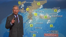
Prince Charles’ Weather Forecast

Prince Charles Weather

'One might need an umbrella…'

It’s always nice to see my BBC weather graphics getting an outing with a new presenter.

Yes, somewhat bizarrely, that’s Prince Charles weather presenter extraordinaire during a visit to the BBC in Scotland yesterday.

Seems he did a pretty good job – you can judge his efforts for yourself over here on the BBC site. By all accounts it’s also causing quite a stir on YouTube.


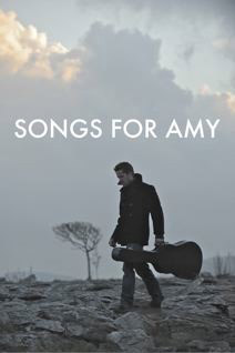
Songs For Amy

Songs For Amy

‘A heart full of songs. A van full of idiots.’

I was lucky enough to get a chance to do some work on the film ‘Songs for Amy’ which has its World Premier next month at the Newport Beach Film Festival, California.

The film is described as ‘a darkly comedic love story, set in the west of Ireland and New York about a musician, Sean O’Malley (Sean Maguire) who writes an album for Amy, the girl he loves (Lorna Anderson), in an attempt to redeem himself. The album takes him on a roller-coaster journey of self discovery, where he is both helped and hindered by his misfit band mates.’

The story, written by Fiona Graham, was inspired by the music scene of the west of Ireland. The film follows, largely in flashback, the joy and heartache behind Sean’s songs and the events that led him to write each song.

‘Songs for Amy’ has a great soundtrack (see www.sonnyandskye.com/productions/music with tracks by Jim McKee, Ultan Conlon, Alabama 3 and the wonderful (and incidentally, fellow native of my wife’s home town of Keshcarrigan!) Eleanor Shanley.

‘Songs for Amy’ is directed by Konrad Begg, written by Fiona Graham and Produced by Fiona Graham and Angela Murray.

And my own contribution to what looks to be great music-inspired Irish independent movie were a number of ‘visual effects’ shots, that (all being well) won’t be noticed by a single person.

For more information about ‘Songs for Amy’ see www.sonnyandskye.com

You can join Songs For Amy on Facebook


Virtual Studio Sets (Setanta 2012)

Saturday saw the launch of two new virtual studios for Setanta Sports. They are the latest in a number of planned new looks rolling out this year – both are based around a single new VR set with a backdrop of seamless virtual screens. I’ll probably do a separate post outlining some of the design process – which might be quite interesting as I now have a much more accurate way of determining what section of the virtual screen appears behind each camera shot. I have also built a single After Effects project that automatically outputs a combination of five HD and SD seamlessly looping animations for the screens as well as a number of special texture maps for various surfaces of the surrounding 3D model.

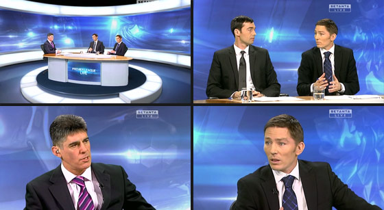
Premier League Studio

Here’s the new set for the Premier League. The imagery features a couple of super-hi-resolution 3D renders of the premier league trophy (kindly supplied by David Phelan at Mode Vision Ltd), mixed with a load of additional layers to provide a little gentle (and seamlessly looping) animation. And finally lens flare effects using Video Copilot’s Optical Flares plug-in of course.

Premier League Virtual Studio Set


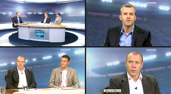
GAA Allianz Leagues Studio

And here’s the new GAA set.

GAA Virtual Studio Set

It uses the same 3D studio model as the studio above, but with a new set of animating screens inspired by stadium floodlights (which figure prominently in the title sequence). I built an HD looping crowd animation and used it to fill up a high-resolution daytime (empty) stadium shot, before giving the whole thing a dusky twilight feel, replacing the original sky with one taken from outside my studio in Leitrim. And finally, of course, plenty of optical flares.

Once again, the screens and additional textures have all been built within, and output from, one mighty After Effects project.


Immortalised in an A-Level question

A level question

A level question

One of my old BBC chums e-mailed me out of the blue to say she’d spotted my name in one of this year’s A-Level exams!

I pop up in one of the externally set assignments for A-level Art and Design. [thanks for the copy Sue!]

It says: ‘When making your response, refer to appropriate examples that might include the work of Mike Afford …’.

I wonder how many students will choose that question and arrive here looking for appropriate examples..?

Seriously though, if there are any students reading this, please feel free to drop me a line with any questions you may have. I do get quite a few student enquiries, and although it may take a little while getting back to you, I do try my best to answer every one.

2 Comments

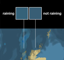
BBC Weather website map colours

BBC Weather map colours

BBC Weather map colours

I’ve been puzzling over this for a couple of days now. *

I’d noticed that the new BBC Weather website was using a different colour for the sea on their maps.

I’d originally designed the weather maps with a deeper blue for the sea, so I was intrigued to see the colour had changed to a paler, less saturated, and slightly more ‘greeny’ blue (some of the more ‘greeny’ blues I’d previously reserved for light rain).

One of the first effects I noticed was that the actual colour on screen for certain levels of light rain over the sea was virtually identical to that of light cloud.

I suppose it’s just a small point really. It’s still fairly obvious where the rain is – but I was just a bit puzzled as to why a (presumably) cosmetic change to the sea colour should have made the rain data in particular so much more ambiguous and obfuscated.

Anyway – I think I’ve figured out why the new maps don’t look quite right to me. read more »